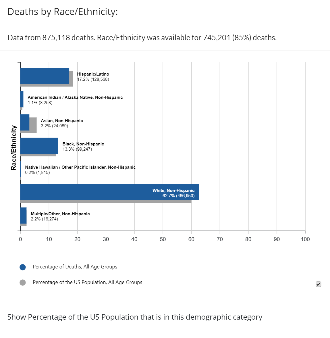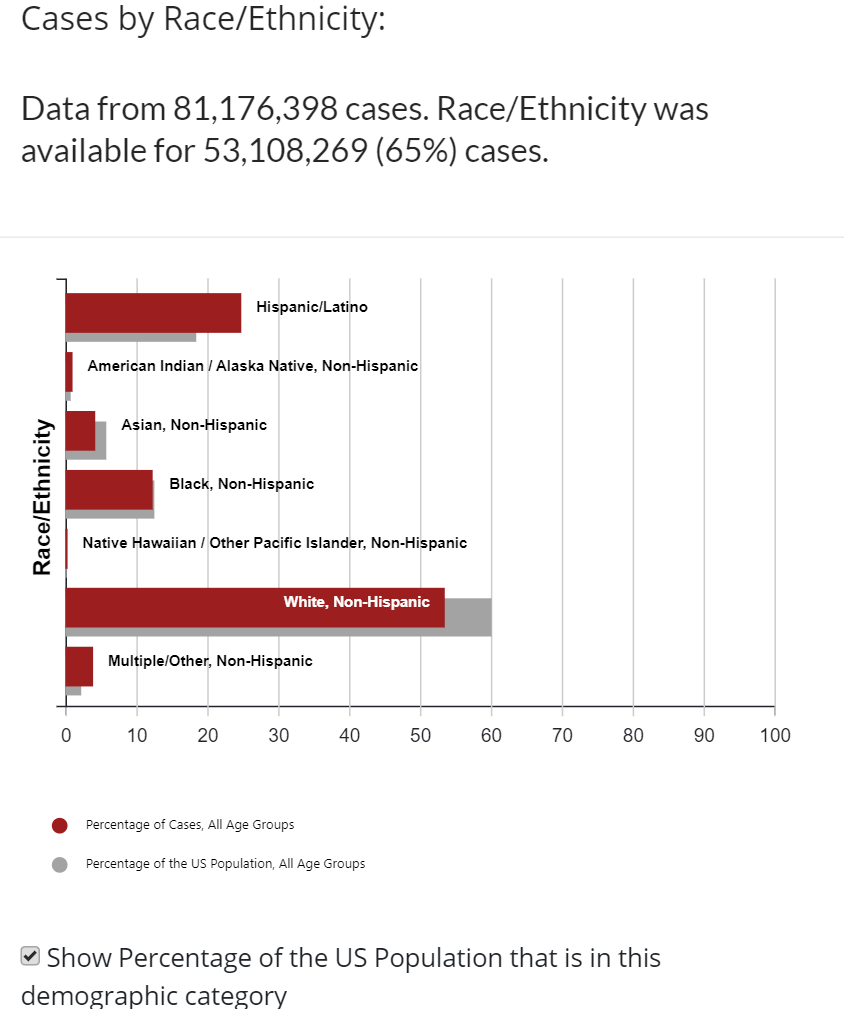

For an idea of how data can be so helpful for so many here’s an example in the COVID-19 pandemic, “...multiple new experiments in data gathering and analysis have sprung up during the pandemic, experiments that might save thousands of lives before the crisis is over. And they may well prevent future pandemics from developing in the first place”.
And they soon found that the more data the better.
“By early February, the Open Covid-19 Data Working Group had assembled detailed records for 10,000 cases. Today an informal network of hundreds of volunteers has assembled records for more than a million cases in 142 countries around the world. It may well be the single most accurate portrait of the virus’s spread through the human population in existence”. This is huge. The better the accuracy, the more likely they can find a solution that can make an impact. And with all the samples, they cast such a wide net that they can see how people were affected from all over. This is basically a scientist's dream to have this much data.
“Of course, the greatest value in that kind of data set lies in the clues it can give us about the future path of the disease and how that path can potentially be interrupted”.
Conclusions:
With this data, scientists were able to draw conclusions such as,
“Life tables are what allowed us to see that Covid-19’s lethality has been disproportionately concentrated among the elderly, unlike the flu pandemic of 1918, which killed an unusual number of young adults”.


![]() © Created by Shimnu Jiang, Alexandria Balde, Dylan Conard, Ethan Tan
© Created by Shimnu Jiang, Alexandria Balde, Dylan Conard, Ethan Tan